A Wizard of Earthsea Graphic Novel Gets Author-Family Oversight and Bold Art
A hardcover graphic novel adaptation of Ursula K. Le Guin’s 1968 classic A Wizard of Earthsea is on the way, bringing Ged’s coming-of-age story to the page with careful supervision from the author’s family and a distinctly cinematic take on Earthsea’s islands. The project is visually ambitious, but it also makes bold color choices that can occasionally make certain panels harder to parse.
What’s being released
Fred Fordham has adapted A Wizard of Earthsea into a hardcover graphic novel published by Planeta Cómics. The book is scheduled for release on June 17, 2026, and runs 288 pages. Its ISBN is 979-13-87921-96-5.
This isn’t the first time Earthsea has crossed into a different medium, but it is described as one of the rarer instances where the adaptation has come with the approval of Le Guin’s heirs.
Background and creative oversight
The adaptation is developed under the supervision of Theo Downes-Le Guin, the writer’s son. Fordham’s background is also positioned as a key reason the project aims to respect the source material: before becoming known in British comics for adaptations of classics such as To Kill a Mockingbird and Brave New World, he studied philosophy and worked across visual professions including mural painting, portraiture, and publicity—experience that shows up in both close-up character work and large-scale landscapes.
Ged’s story, and the core ideas the adaptation targets
The graphic novel retells Le Guin’s central arc about Ged, a young boy who discovers extraordinary talent for magic early on, only to have that gift clouded by pride and ambition. The narrative is framed as a lesson that power always has a cost, with Ged learning through multiple teachers whose teachings draw on Taoist philosophy—emphasizing balance and harmony.
Le Guin’s magic system, as presented in the adaptation’s description, is not treated as spectacle. Spells disrupt the world’s equilibrium and require responsibility from whoever uses them. The approach is linked to “true” words and a deeper understanding of nature.
As Ged reaches for forbidden knowledge, he releases a dark force that threatens both his path and the balance of Earthsea. From that point, the story shifts into a more personal pursuit: the adventure becomes a confrontation with what Ged fears most, with the emphasis on inner conflict rather than only external danger.
- Ged proves early talent for magic, then lets pride and a hunger to prove himself take over.
- Multiple mentors guide him toward a philosophy of balance, responsibility, and harmony.
- Magic is portrayed as something that alters the world’s equilibrium, not just an effect for show.
- Ged seeks prohibited knowledge and unleashes a dark threat that endangers Earthsea.
- The conflict evolves into an inward journey, pushing Ged to face his deepest fear.
How the adaptation handles Le Guin’s text
One of the adaptation’s emphasized strengths is its treatment of Le Guin’s original voice and tone. The explanation is that Fordham preserves Le Guin’s wording and atmosphere wherever the constraints of the graphic novel format allow. Theo Downes-Le Guin notes that Fordham performed a detailed analysis of the book, with much of the text drawn directly from the original and only certain narrative moments reshaped—such as converting portions into dialogue or compressing sequences—to fit the visual medium.
The adaptation still necessarily makes typical graphic-novel tradeoffs—condensing situations, trimming passages, and creating dialogue where the book form may not have it—but the stated goal is that the spirit remains intact.
Correcting past visual mistakes about Ged
A second major point highlighted is visual fidelity to Ged’s intended identity. The adaptation is said to address an issue seen in prior Earthsea adaptations: at least some versions altered key details, including representing Ged as a light-skinned, Caucasian character, which conflicts with Le Guin’s description.
Fordham’s version is described as correcting that: Ged is depicted as a young person with dark copper-toned skin. In the lead-up, Theo Downes-Le Guin identifies this as one of the family’s major concerns, noting that for decades, different visual interpretations had betrayed the author’s vision. The graphic novel is also described as respecting the broader ethnic and cultural diversity associated with Le Guin’s world.
Art style: portraits, landscapes, and a color tradeoff
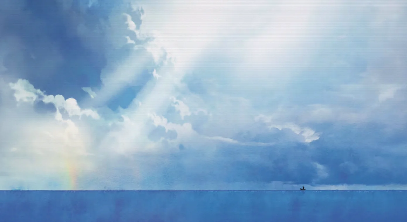
Visually, Fordham’s work is praised for both character portraits and the reconstruction of Earthsea’s landscapes. Many panels and panoramas are described as especially striking, capturing the sense of vastness and mystery that defines the archipelago. The use of watercolor is credited with strengthening the evocative tone of the images.
The art is also described as balancing near-realistic character and environment depiction with highly cinematic staging—aiming to convey Earthsea’s large scale without losing the story’s intimate emotional focus. In this framing, the islands feel ancient and immense, while the visuals still track Ged’s inner development.
However, the adaptation’s color approach is also criticized. The coloring is said to reflect the characters’ emotional states, resulting in many sequences dominated by muted, dusty, and dark ochre tones. While the intention fits the protagonist’s internal journey, the practical effect is that some panels can be difficult to read because distinguishing figures from background settings becomes harder. The issue is not isolated to a few pages; it extends across a significant portion of the book, which means the color strategy sometimes works against fully appreciating the linework and panel detail.
Verdict
Fordham’s A Wizard of Earthsea is presented as a notable adaptation of a landmark fantasy novel, combining textual and tonal fidelity with a respectful, beautiful visual translation of Le Guin’s universe. It’s also framed as a difficult achievement in its own right: making a world that’s deeply rooted in readers’ imaginations come to life on the page without losing its essence.
The main drawback is ultimately tied to readability—color choices that darken a substantial number of pages can occasionally obscure visual clarity. Even so, the adaptation is positioned as close to exemplary, with that sustained chromatic approach being the key factor holding it back from being universally seamless.